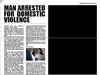
THE IDEA FOR MY INDIVIDUAL EDIT FOR THE ONE SHOT FILM IS: SET IN THE FUTURE NEWSPAPER ARTICLES. THIS IS WHY THE PAPER IS ALL OLD AND STAINED AND SOMEONE FROM THE FUTURE FINDS THIS BALL OF PAPER AND OPENS IT UP. THIS IS WHY THE PAPER IS ALL CREASED. THE NEWSPAPER WAS CREATED FURTHER IN TIME THAN WE ARE NOW SO THE NEWSPAPER COULD PLAY NEWS REPORT VIDEOS.
THE ORIGINAL DESIGN FOR THE NEWSPAPER BACKGROUND: DONE FOR GROUP.
Done in illustrator.
Things I changed:
- I changed the sound - – tuition fees, http://www.youtube.com/watch?v=feEDsiuaY5o - domestic violence,http://www.youtube.com/watch?v=dDBIn0dVma4&feature=related – unemployment
- The titles of the newspapers so that they would be more fitting to the sound.


Really good edit! I particularly like the newspaper effect you've created! I also think the sound fits in really well with the footage. Well done!
ReplyDeleteThe visuals look good :) I think the newspaper and effect you used looks better in this edit than the other design would, and also the sound track works pretty well too, but its supposed to be a one shot film so you might need to find a way to redo this edit without cutting the actual video... in this one its been cut a few times :O
ReplyDeleteThis is really interesting. The sound, speeded up at the end is a bit funny. Can you cut the interview shorter? Occasionally the graphic cuts out can you make it continuous?
ReplyDeleteI would also try to increase the brightness and contrast of the video image to make it easier to see. Perhaps show less of the newspaper if possible so that the image is bigger.
Nice idea
Very good idea. I like the use of the old style media (newspaper) and the current media (television). In terms of the film more work could have been done in the edit, the moving images used are a bit small and you find yourself looking more at the newspaper article and using the sound to guide you.
ReplyDelete