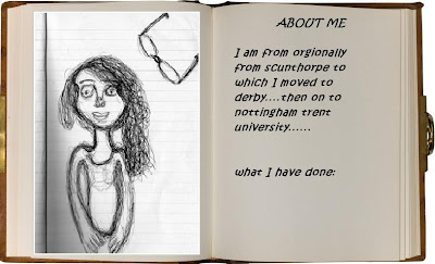
http://www.photoshopatoms.com/effects/creating-a-book-effect/
http://www.1stwebdesigner.com/wp-content/uploads/2010/09/Vintage-Paper-Canvas.jpg
Hey this is Rach aka Baz or Rashy and this is me working like a beaver on ma Multimedia Journal. Have a look what I am up to ;-)
Thursday, 3 February 2011
Tuesday, 1 February 2011
Planning of WEBSITE
This is the orgional wireframe indicating what will be on all pages of the web pages.
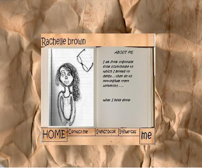
This is a mock up of what it could look like, without the infomation book next to the picture. Decided to see what a full picture would look like.
Wireframe 2
Subscribe to:
Comments (Atom)


